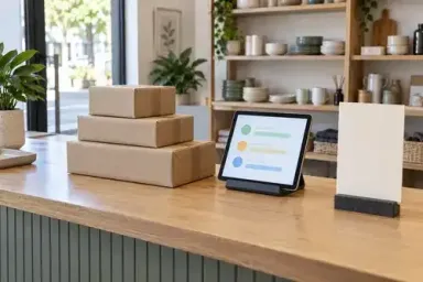

An online order is not the end of a click-and-collect experience. The customer still needs to know when to leave home, which location to visit and how to receive the purchase. Good collection instructions make those decisions easier before the person reaches a busy counter.
The website and the physical collection point should describe one workable service. A clear checkout option loses value if the arrival message is vague, while a well-marked counter cannot explain a preparation delay that the customer was never told about. Plan the information and the handoff together, using the process the business can actually deliver.
If you are reviewing Melbourne signage for a local collection point, give the supplier the approved pickup wording and an accurate description of the premises. Explain how customers learn that an order is ready and where staff receive them. The sign design can then support the service you have planned online.
Define the pickup service before adding the option
Start with the available location, the products that can be collected and the staff workflow that makes collection possible. Decide how orders are prepared, where they wait and who completes the handoff. A pickup option should reflect those arrangements rather than become a promise the store has to work out later.
Sarah MacDonald and Chloe West's August 2026 click-and-collect guide for Shopify describes the sequence from online selection through preparation, notification and collection. That broad sequence is useful for planning even when a business uses another platform.
Choose language that matches the actual service. In-store collection, a staffed collection counter and a vehicle pickup bay involve different instructions. Do not advertise all of them simply because the platform or a template offers several options.
Make the boundaries understandable. If some products, locations or times are excluded, decide where that information needs to appear before a customer commits to the order. The relevant details should be confirmed by the person responsible for the service and reviewed when it changes.
Separate the order states in your content plan
The order has been received
An order confirmation tells the customer that the business has received the purchase. It should not imply that the parcel is already waiting at the counter unless that is true. Review the wording with the fulfilment team so that the customer-facing message matches the point the order has reached.
Explain what happens next using a timeframe or process the business can maintain. If the customer needs to wait for another message, make that instruction clear. Avoid placing a generic “collect now” button beside a confirmation that still requires preparation.
The order can be collected
The readiness message should give the customer the information needed for this particular collection. That may include the chosen location, collection arrangements and the relevant order reference. Keep it focused on the next action rather than repeating the entire product description.
Review how this message appears on a phone. Customers may open it while travelling or while approaching the premises. Put the essential instruction where it is easy to find and make any help route understandable if their plans have changed.
The collection needs attention
Plan the message for a delay, a location problem or an order that requires clarification. Decide who sends the update and which information must change elsewhere. A customer should not receive one message explaining a delay while another page still says the order is ready.
Use specific, accurate wording for the situation. Do not leave staff to interpret a vague automated notification that gives the customer a different expectation. The content plan should include these less convenient moments as well as the smoothest version of the journey.
Align the location details across the online experience
Review the pickup information at the points where the customer chooses and confirms it. Check the location name, address, collection arrangements and any distinction between general trading hours and collection hours. Use a consistent label for the same place.
If the collection entrance is different from the main retail entrance, explain the difference in the relevant instructions. A current photograph may help if it accurately shows the approach. Avoid relying on an old image or on a landmark that may disappear during nearby work.
Our mobile-first e-commerce design guide discusses the wider shopping experience on a phone. For pickup, apply that review to the order-related pages and messages as well as the product page. The information should remain readable after checkout.
Be careful when copying content between locations. A useful instruction for one branch may send a customer to the wrong door at another. Keep the facts attached to the location they describe, and assign someone to confirm them before publication.
Make the collection point identifiable
A customer arriving with a ready order needs to recognise where the service happens. Consider what they can see from the actual approach and whether the collection point is distinct from other counters. The physical message should use the same name that appears in the online instructions.
GetQuickSigns' September 2026 pickup sign planning article discusses how signs support the questions customers face on arrival. For your premises, choose the locations that answer a real uncertainty rather than adding a panel wherever there is spare wall space.
Keep the main message short enough to use in its setting. A counter identifier may only need to confirm the service, while a nearby instruction can explain the check-in action. Ask the supplier how the proposed scale, materials and position will work at the site, with the appropriate project reviews where required.
Do not allow temporary promotional displays to hide the collection identifier. Review the area with the fixtures and merchandise in place. If the collection point moves during a refit, update both the physical message and the online directions that refer to it.
Agree the staff handoff and a useful fallback
The collection process needs a clear way for staff to locate the correct order and confirm the handoff. Agree what the customer is asked to present and make the instruction consistent with the business's order procedure. Avoid displaying personal order details publicly as a substitute for an organised staff process.
Decide what happens if the customer cannot find the message, arrives before the order is ready or needs help at a different counter. Staff should know the fallback arrangement and be able to explain it plainly. The solution may be a simple help point rather than another online feature.
Instacart's pickup flow documentation, updated in May 2026, provides one platform-specific example of readiness and arrival information working together. It is an example of the coordination problem, rather than a claim that every online store has the same features.
Have the team review the process under normal operating conditions. A plan that works when the counter is empty may need adjustment when customers are waiting for other services. Consider who answers a pickup question and how the order is retrieved without leaving the rest of the service unclear.
Give the web designer a service brief
A pickup brief should describe the order states, customer messages and location details the website needs to support. Include the operational owner who can confirm each part. The designer should not have to invent preparation times or collection conditions to complete a screen.
Our guide to hiring e-commerce web designers in Australia explores the wider project discussion. For collection, ask the designer to show how the proposed journey handles readiness, location selection and the information customers receive after ordering.
Keep production requirements separate from shared facts. The web designer and sign supplier can use the same approved wording, but they need different inputs for their outputs. Confirm who provides the relevant site information and who approves any physical installation proposal.
Record what will be maintained after launch. A change to collection hours may affect several messages and pages, as well as the material at the premises. Give the business a manageable update process rather than a feature that depends on somebody remembering every copy of the wording.
Test from checkout to handoff
Before offering the service more widely, arrange an appropriate test with the business and its platform team. Follow the journey from selecting collection through the messages and staff handoff. Confirm that the chosen location and order status remain clear at each stage.
Use a colleague who has not helped design the process to review the instructions. Give them a realistic task and note where they need an explanation. The aim is to find unclear content or missing operational steps while the team can still correct them.
Check the less convenient cases as well. What does a customer see if a message is delayed? What happens when a location is unavailable? Which instruction should staff follow if the customer approaches the wrong counter? Agree the relevant tests with the people responsible for the actual system.
Keep a record of issues and decisions. Fixing a message is easier when the team knows which order state it describes and which screen or notification needs changing. Recheck the affected route after a revision, rather than assuming that editing one sentence resolves the whole problem.
Review the questions customers actually ask
After launch, collect practical observations from the staff handling orders. Repeated questions about readiness, collection hours or the location may reveal a content problem. Confirm the cause before deciding whether the answer is a website change, a sign adjustment or a different staff workflow.
Our online store optimisation guide looks at the broader review process. For pickup, start with the parts of the service the business can observe reliably, such as incomplete handoffs or a recurring instruction that customers misunderstand.
If you review preparation or collection times, define the start and end of the measure. Keep the operational context with the result. A busy period, a stock issue or a different staffing arrangement may affect the experience independently of the wording or signage.
Do not assume that clearer signs alone explain a sales change. Their immediate role may be to help customers find the collection point. Report that practical purpose and any relevant observations without turning a small internal review into a claim about guaranteed revenue.
A fictional homewares store example
Imagine an online homewares business that offers collection from its retail shop. The checkout confirms the shop address, but the order email does not distinguish receipt from readiness. Some customers arrive while their order is still being prepared.
The team revises the message sequence with its platform provider and confirms which staff action triggers the ready message. It also gives the collection counter the same name used in that message. The store then reviews the instructions with a colleague who has not been involved in the setup.
The example is about joining the online content to the service behind it. A new sign helps identify the counter, while the revised notification explains when to approach it. Neither improvement has to carry the entire collection process on its own.
Collection should feel like the next clear step
Click and collect is easier to use when the customer can understand the order's status, find the right place and complete a straightforward handoff. Accurate messages, an identifiable collection point and a prepared staff team all contribute. Planning them together gives the online purchase a clear continuation beyond checkout.